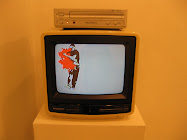
Between downpours I stepped out last night, the flooding dissipated inside the loop by 5 or 6. Space 125 had a good showing, their small gallery is tough to curate without overstuffing the turkey, but they seem to have settled down with this new one.

Mick Johnson, The Clash 2007
"Suddenly One Summer" makes up for a horrible title with a good mix of subdued work. Mick Johnson channels the Clash by cutting out (die-cut?) handwritten lyrics on the edge of a board- set at bench height. EVERYONE should know that no matter what your intentions or connotations are, if you build something flat and horizontal between you knee and your hip people will sit on it. There's nothing you can do, get over it and leave your please do not touch signs at home. Anyway, the three sided bench was a little too illegible to read the lyrics Mick had printed out on the list of works, and it was set in front of a large wall, yellow at the top, magenta below.
Mark Cervenka provides two representational paintings in an olive, sienna and black scheme that is couch friendly. When I was reading the three artist statements I watched two rich ladies walk in front of me and grab his statement alone. How rude! Maybe they have couches that match, but that doesn't mean those gloomy alienated scenes by Cervenka won't ruin your oilman husband's day as the stock market goes down the drain. Mark's paintings are Hopper-ish with more intimacy, maybe interesting despite their traditional construction.
Beth Secor has been doing these intimate portraits for a good decade or more, but it took a busted ankle and a little rest time for her to apply her sketchy arcs of layered color to a medium besides paint. Several portraits here are interesting studies of friends and children, but the one with the mattress pad fabric backing takes the cake- a thread portrait that is not exactly needlepoint nor knitting, but that takes clear strides in execution from Secor's paintings, growing more tactile and achieving an element of time through her recollection of which horrible 50s-60s horror movie she was watching while sewing each portion of the piece. We'll she where she goes with this idea soon enough!
I stopped by the CAMH to check out Nexus Texas before the opening tonight, it was nice to see El Franco Lee II's prominant placement front and center (he's gonna be big). Besides an excess of Sterling Allen in the corner, and a little more Amy Blakemore than I would have liked, the show looks more interesting that I would have expected. Screw those guys from Dallas, but this show might look good!


5 comments:
" ... maybe interesting despite their traditional construction." What is it about traditional construction that irks you? The level of skill? Or, are you so ready to attack an external cliche that you fail to notice your own?
Just positing. Otherwise, I enjoy the news. Thanks.
Representational painting holds no new ground for painting today, neither does abstract painting. The connotations, the references, are what is interesting about painting today.
The genre is so rich in historical precedent that the application of paint is without innovation; in representational painting the symbolist tendencies of contemporary culture are all that a painter today can hope to elaborate upon.
If it is cliche to bash representational painting, then I am fine with my cliche-ness. The level of skill is applaudable, especially in this case, but we are in a market- the art market- which makes light of such concerns and demands content first and foremost.
C'mon, that's a perversion of logic unless, for some reason, you think the same cannot be cross-applied to music or literature.
We disagree on the aims of painting, and I think, art in general. To concern oneself predominantly with innovation and "content," is to put beauty in the back seat, and ultimately - and I think fallaciously - re-define visual art to suit a misguided epoch and its' patrons need for apartness.
Rich historical precedent is painting's greatest strength - not its' weakness.
Thanks, that's all. :)
Yes, we do seem to disagree on the subject... I've got to run out but I'll be back.
Well, painting's greatest strength and greatest weakness is its historical precedent! Contradictory enough? I still think it's true.
It may be perverse logic, and I'm OK with that. I'm perverted about painting. Visual art has not grown away from beauty, but beauty has grown away from beautiful. Guernica is beautiful and horrible. Hermann Nitsch's grotesque goriness is beautiful. Fassbinder's films, Warhol's films, Gus van Sant...
I just think personal resonance is the new beautiful. Not a universal beauty, but one where any and everyone has a chance to choose their beauty without prejudice or precedent, so that we can disagree on what is beautiful without having to come to a conclusion. :)
Thanks for the feedback!!!
Post a Comment